40+ Color Palettes for Websites
One of the factors people will judge your website’s credibility on is its color scheme. A strange, incoherent color scheme can make your website (and business) look highly unprofessional. But a beautiful, seamless color palette can do the opposite.
So, it’s important to choose a great color scheme. And since everyone wants a color scheme that looks beautiful, but also fits their aesthetic it’s important to do a little work into choosing the right color scheme for you. In this blog post, we’ll give you more than 40 ideas. Keep reading!
40+ color palettes for websites
This “Rustic Elegance” color palette evokes a sense of timeless elegance with its deep, muted hues reminiscent of aged wood and warm, dusky roses. The harmonious blend of dark charcoal, rich mahogany, and soft, earthy tones creates a sophisticated and inviting atmosphere perfect for a website seeking a classic yet contemporary aesthetic.
This “Coastal Retreat” color palette blends cool blues and teals with soft neutrals and a warm brown accent, creating a balanced and inviting aesthetic. This palette is ideal for websites aiming to evoke a sense of calm and grounded sophistication.
The “Tranquil Sky” color palette features a harmonious blend of soft blues and gentle whites, evoking a sense of calm and serenity. This color scheme is ideal for websites aiming to provide a soothing user experience, making it perfect for wellness, lifestyle, or educational platforms that wish to convey peace and clarity.
The “Sunset Harmony” color palette combines shades reminiscent of the sky at dusk, with cool blues creating a sense of calm and trust, while warm oranges add vibrancy and energy. This combination is ideal for a website aiming to balance professionalism with creativity, appealing to audiences seeking both reliability and innovation.
The “Sunlit Breeze” color palette combines gentle sky hues with warm, inviting tones, creating a harmonious and refreshing visual experience. This blend of colors is ideal for a website seeking to evoke a sense of calmness and energy.
The “Sunset Ember” color palette features a bold, warm spectrum of shades ranging from deep scarlet to soft peach, creating an inviting and energetic atmosphere. It is ideal for websites aiming to evoke passion and warmth.
The “Tranquil Greenscape” color palette combines calming greenish-blue tones with soft, muted accents to create a tranquil and refreshing aesthetic. This palette is ideal for websites aiming to evoke a sense of peace and connection with nature.
The “Autumn Harvest” color palette combines warm, golden tones with deep, rustic browns to evoke a cozy, inviting atmosphere. This palette is perfect for websites that want to highlight natural, handcrafted, or seasonal qualities.
The “Coastal Blossom” color palette blends soft ocean blues with warm peach and muted rose tones to create a refreshing yet comforting atmosphere. This palette is ideal for websites that want to evoke feelings of calm, elegance, and nature.
The “Dynamic Wave” color palette combines soft, serene greens with bold oranges, deep blues, and vibrant pinks to create an energetic yet balanced look. This palette is ideal for websites looking to make a bold statement while maintaining a sense of harmony.
The “Urban Retreat” color palette combines muted greys, soft browns, and deep blues to create a sophisticated and grounded atmosphere. This palette is perfect for websites aiming to evoke a sense of elegance and modernity.
The “Tranquil Shore” color palette combines deep blue shades with soft sandy hues and warm sunset tones, creating a harmonious and calming visual experience. This palette is ideal for websites aiming to evoke a sense of relaxation and trust.
The “Pastel Bloom” color palette combines soft pinks with airy blues and teals, creating a light and playful yet polished look. This palette is perfect for websites aiming to feel cheerful and approachable.
The “Twilight Blossom” color palette pairs deep, rich blues with warm, muted pinks and a light neutral to create a harmonious and sophisticated vibe. This palette is perfect for websites aiming to convey a sense of refinement and approachability.
The “Lavender Mist” color palette blends a muted grey with delicate purples and soft, airy neutrals to create a calm and understated aesthetic. This palette is perfect for websites looking to evoke a sense of elegance and tranquility.
The “Sapphire Bloom” color palette combines deep, rich blues with warm pink and soft golden tones, balanced by a light neutral for a refined yet inviting aesthetic. This palette is ideal for websites seeking to convey sophistication with a touch of warmth.
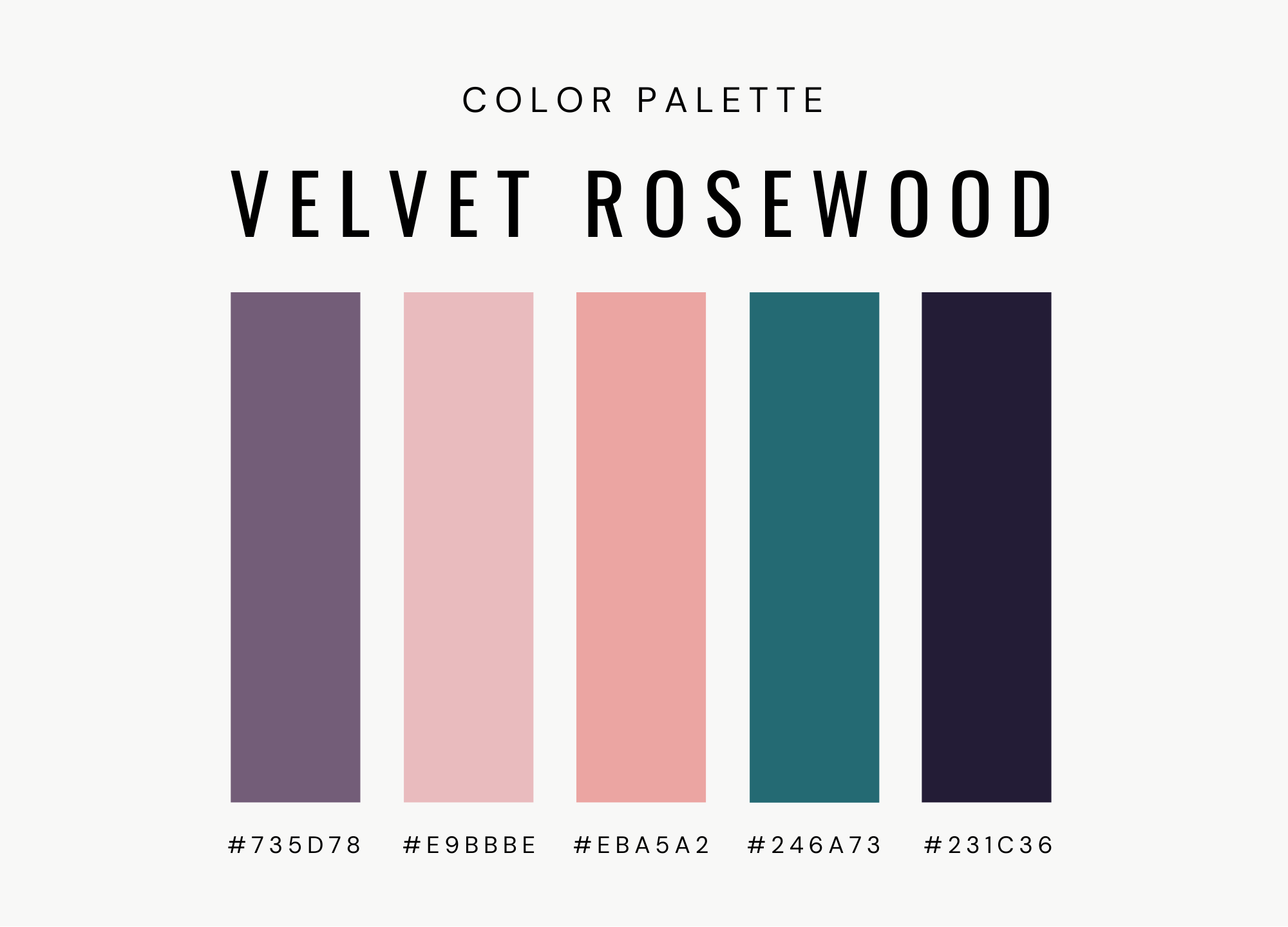
The “Velvet Rosewood” color palette combines deep, moody purples and greens with soft pinks and muted neutrals, creating a rich and sophisticated look. This palette is perfect for websites seeking to evoke elegance and depth.
The “Cloud Serenade” color palette combines light blues and soft greys with a subtle lavender accent, creating a fresh and airy feel perfect for an inviting website. This palette is ideal for brands looking to convey a calm, approachable, and modern vibe.
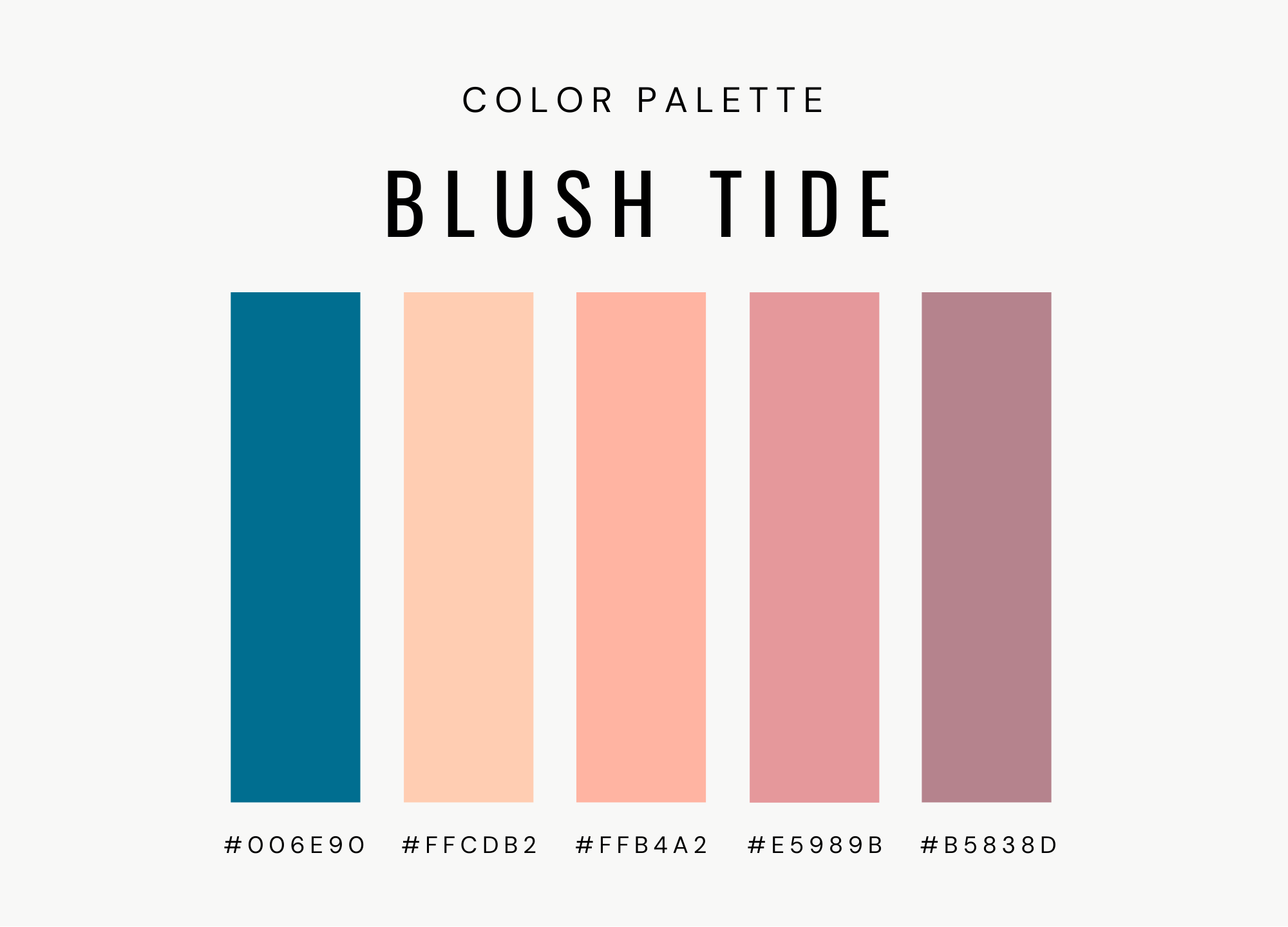
The “Blush Tide” color palette combines rich ocean blues with warm coral and soft pink tones, creating a vibrant yet soothing aesthetic. This palette is perfect for websites looking to evoke a sense of playfulness and warmth, making it ideal for brands that want to stand out with a lively and inviting look.
The “Forest Mist” color palette combines soft, muted greens with deep, earthy tones to create a calm and grounded atmosphere. This palette is perfect for websites aiming to convey tranquility and connection to nature.
The “Autumn Grove” color palette blends warm earthy tones with muted greens, creating a balanced and inviting atmosphere that feels both grounded and natural. This palette is perfect for websites aiming to evoke a cozy, organic vibe.
The “Crimson Waves” color palette features a striking combination of bold blues and vibrant reds, creating a dynamic and energetic feel. This palette is perfect for websites seeking to make a strong visual impact, ideal for brands that want to stand out with confidence and energy.
The “Blue Horizon” color palette blends cool, calming blues with soft, airy tones to create a fresh and peaceful atmosphere. This palette is ideal for websites looking to evoke tranquility and simplicity, making it a great choice for brands that want to create a serene and modern feel.
The "Rustic Charm" color palette combines earthy neutrals with soft greens and warm browns to create a grounded, welcoming atmosphere. This palette is perfect for websites that want to evoke a sense of natural warmth and sophistication
The “Cinnamon Spice” color palette blends deep, warm hues with soft, rich neutrals to create an inviting, grounded atmosphere. This palette is perfect for websites aiming to evoke a sense of comfort, warmth, and sophistication, making it ideal for brands in hospitality, home décor, artisanal products, and more.
The “Twilight Harmony” color palette features a deep midnight blue, a muted teal, a soft gray, a gentle peach, and a warm apricot. This palette offers a balanced blend of both soothing and intense tones, making it ideal for a website aiming to create a modern and unique aesthetic.
The “Earthy Rose” color palette blends earthy greens with soft, muted pinks and warm neutrals to create a balanced and inviting look. This palette is perfect for websites seeking a natural, grounded feel, making it ideal for brands in wellness, eco-friendly products, or artisanal goods.
The “Botanical Blooms” color palette combines fresh, light greens with deep, rich purples to evoke a sense of natural beauty and elegance. This palette is perfect for websites that aim to convey a sense of vitality and luxury, making it ideal for brands in beauty, health, or eco-conscious sectors.
The “Timeless Retreat” color palette combines cool, calming shades with warm, earthy accents, offering a balance between modern elegance and natural comfort. This palette is perfect for websites that want to evoke trust and sophistication.
The “Warm Mystique” color palette blends rich, deep tones with soft, muted accents, creating a sense of mystery and sophistication. This palette is ideal for websites looking to convey elegance and creativity, making it well-suited for fashion, beauty, or boutique brands that want to stand out while maintaining a luxurious feel.
The “Serene Depths” color palette combines cool, calming tones with subtle neutrals, evoking a sense of tranquility and modern sophistication. This palette is perfect for websites that want both a welcoming and stylish atmosphere.
The “Blue Jungle” color palette combines deep blues and subtle neutrals with a pop of warmth to create a bold yet calming aesthetic. This palette works well for websites that aim to balance professionalism with creativity, making it ideal for businesses in design, tech, or personal blogs.
The “Metro Burst“ color palette features a blend of cool blues, greens, and bold oranges, creating a modern and energetic vibe. It's perfect for a website that wants to convey creativity, innovation, and a sense of adventure, while maintaining a balanced, professional feel.
The “Blush Harmony” color palette features a sophisticated blend of muted purples and warm peach tones, creating a balance of elegance and warmth. Someone might choose this palette for their website to evoke a sense of charm and approachability, making it ideal for brands focusing on lifestyle, beauty, or creative industries.
This color palette blends soft pinks with deeper rose tones, creating a harmonious, feminine vibe with a touch of sophistication. It’s ideal for websites focused on beauty, wellness, or lifestyle, offering a calm yet elegant atmosphere that appeals to audiences seeking a warm, inviting experience.
A harmonious blend of blues and greens, this palette creates a cool, refreshing atmosphere. It’s perfect for designs that aim to evoke a sense of tranquility and reliability.
This palette has a beautiful mix of soft blush tones and cool blues, this palette radiates calmness with a touch of elegance. Great for projects that need an inviting feel.
A playful yet soothing combination of greens and blues, this palette creates a balanced, uplifting vibe. It’s great for designs focused on renewal, serenity, and a sense of well-being.
This color palette combines cool, earthy tones with deep blues and teals, creating a refined, professional look. It’s a great option for designs focused on elegance and clarity.
This vibrant, nature-inspired palette combines soft greens with deep, earthy tones to create a fresh, energetic feel. It’s perfect for designs focused on renewal, vitality, and natural beauty.
This palette blends cool, muted grays with rich teals and deep, earthy tones, creating a refined, modern look. It’s a great option for designs focused on balance, strength, and a contemporary aesthetic.
This palette blends soft neutrals with muted blues and purples, creating a calm and sophisticated look. It’s a great option for designs that aim for a refined, professional look with a touch of calm and creativity.
This playful and fresh color palette combines soft pinks and vibrant greens, creating a lively, joyful atmosphere. It’s ideal for designs focused on positivity, vitality, and a fun, lighthearted vibe.
Want to learn more?
And hopefully, this blog has given you some ideas for your website’s color scheme. But do you want more help? Higo Creative is a Squarespace web design agency committed to helping entrepreneurs and small businesses improve their online presence, so check out some of our favorite blog posts to get some inspiration!
Pastel color palette ideas for your brand or website
Luxury color palette ideas for your brand or website
Pink color palette ideas for your brand or website
Calming color palette ideas for your brand or website
Nature-inspired color palette ideas for your brand or website


